

Event action control properties
Event action control properties are defined on the Definition tab:
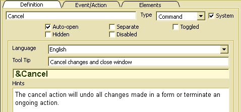
The action label (e.g. Cancel) is displayed, when the action is associated with a visible GUI element (e.g. button or menu item). In order to select a letter as short cut letter, that allows activating the action by pressing Alt-key, any letter in the label may be preceded by &. In order to provide multilingual applications, the label text may be defined in different languages by changing the language selection (Language).
Event action control properties (Definition and Event/Action) define event action defaults, which may be overwritten in event actions in a certain context (ADK_EventAction) referring to this event action control.
The action type has to be defined for simple actions, i.e. actions without sub or group actions (Elements tab). In order to define an command action, i.e. an action that is executed without changing the action item state, Command has to be selected.
In order to define a toggle action that shows toggled or untoggled state after being pressed, Toggle has to be selected.
When an action type is required but not defined (undefined), Command is assumed. When defining subordinated group actions, Toggle is assumed for all actions in the group action list.
The check box indicates, that the action has been copied as system resource. System resources have been copied when creating the resource database. Since system resources are used in different context, one should be careful when going to change properties for system resources.
Usually, this option is set. In order to avoid opening the action when being referenced, one may switch off the property. When auto-open is off, the action cannot be activated in the application.
When this option is on, a separator is inserted before the event action when being displayed in an event action list (menu or tool bar). Otherwise, the option has no effect.
For toggle actions, the switch allows changing the initial state for the action control. When the option is set, visible event actions associated with this event action control are shown with toggled state. When the the event action is not a toggle action, it will be turned into a toggle action automatically, when this option is set. The toggle state is changed when clicking the action item. It may also be changed while running the application by calling odabagui::ActionItem::toggled().
Within a list of group actions, exactly one action should be marked as toggled in order to define the initial state of the action group.
Action items defined as command automatically become toggle actions, when toggled state is set.
In order to hide the action initially, Hidden and/or Disabled should be switched on. When activating this option, the action is hidden after being opened. Hidden actions are not visible, but may still be executed (e.g. by using shortcuts). The hidden state may be changed while running the application by calling odabagui::ActionItem::visible().
In order to disable the action initially, Disabled should be switched on. Then, the action is disabled after being opened. Disabled actions are visible but cannot be executed, i.e. also actions associated to shortcuts cannot be executed when being disabled. All visible action elements referring to this event action control are displayed with disabled state. The disabled state may be changed while running the application by calling odabagui::ActionItem::enabled().
Tool tips are usually shown, when moving the mouse over a visible event action element. The tool tip text may be language dependent. Providing tool tips for different languages allows supporting multilingual applications.
Usage hints are displayed for the selected GUI element together with content explanations when pressing Shift-F1 or calling the Help default action. Usage hints may be language dependent. Providing usage hints for different languages allows supporting multilingual applications.