

Combo box
In order to create, update or browse list box styles, one may select Objects/Styles/List Box.
A combo box usually requires two data sources. One is a single field or referenced instance displayed in the single line edit control on top of the combo box. The other is a collection to be displayed when the list is expanded.
The control data source will be displayed in the single line edit/display field of the box. The data source for the list can be defined in the Base Collection definition of the data source. When no base collection is defined, the default base collection defined in the object model will be displayed in the list.
In order to use combo boxes for selecting a single instance in a collection, one may also define a collection as data source for the combo box control. No base collection must be defined for the data source in this case and the data source must be marked as collection (collection must be switched on). In this case. the line control of the combo box displays the currently selected instance.
A drop combo box contains a single line edit field on top of the drop list that shows the current value of the data source. For relationships, the drop lists displays the instances from the relationships base collection. In order to change the referenced instance, one may pick up an item from the list and the new link will be created. In order to assign a new instance to a reference or relationship, one may enter the key for the new instance in the single line edit.
The drop list shown for the combo box is, typically, a simple list. Depending on a more complex design, the list may, however become much more sophisticated. Following list properties might be influenced:
- List style (list or tree)
- List columns
- Decoration
The list style used for the drop list depends on the style object (ADKS_ListBox) linked with the field control (ADK_FieldControl). ODE delivers two standard styles for drop lists, which might be used. Selecting the _listdrop list box style creates a plain list in the drop box. Selecting _treedrop shows a tree in the list box.
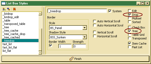
When defining an own drop list style,the Drop option has to be switched on. The appearance of the list depends on the Tree option in the style definition.
Using trees in drop boxes becomes a bit dificult, since expanding and collapsing trees does not work properly. Hence, one should expnad the tree completely (e.g. by oberloading the doAfterFillData() handler.
In order to define list columns for the drop list, a column list has to be defined in the control definition. The default combo box controls do not define columns and show single column key values in the list. In order to display data different from the default order key, one or more columns might be defined.
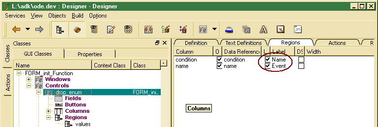
In order to show a column header in the drop list, at least one column label should be activated (check box switched on). One may re-order the list by column values by clicking the column header labels, when being defined and when sorting has not been disabled in the field data source.
By default, enumerator names are displayed for enumerations in combo boxes. In order to display the label, a column label might be defined or the order key in the control data source might be set to label.
When filling the drop list, the combo box control also receives a BeforeDataSet event. The doBeforeDataSet() handler might be overloaded in order to change decoration (line icons), style (line font) or tooltips and help information for each line or cell in the list. Default decoration might also be defined in the drop list field control or for column and region field controls.