

List
Simple list controls display a number of list items with one column. The data source for the list is the data source defined for the list control.
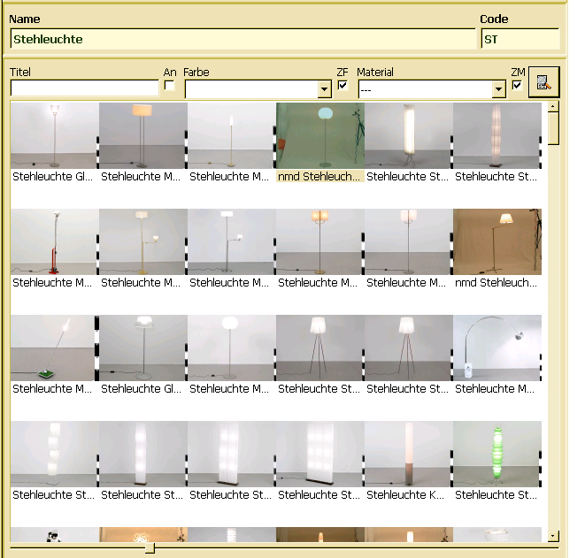
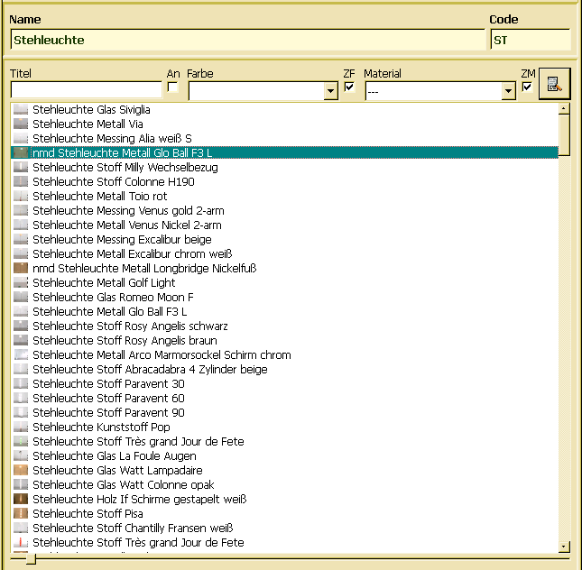
Items might be decorated by icons, which are usually assigned to a list item in the doBeforeDataSet() handler. List items may be displayed vertically (top to bottom) or horizontally (transposed or icon view). Vertical (image) view re-sizes the image to the size requested by the application (default is 100 x 120 pixel). Horizontal view (default) shows the list items from top to bottom with the icon left of the text and a fixed size (16 x 16 pixel).
When the view mode has been changed to image view, the image is read from the icon's normal path, i.e. when implementing the doBeforeDataSet() the normal path for the icon has to be set, only. In order to create, update or browse list box styles, one may select Objects/Styles/List Box.
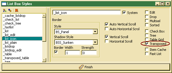
By default, the list will be displayed in list mode, i.e. decoration (images) are displayed left from the item text. In order to switch to icon view (transposed presentation from left to right), the Transposed property has to be enabled. When Transposed is, one should disable horizontal scroll bars, which would not work for transposed view. In order to switch the view mode during run-time, one may also change the image_view property (see examples below).
// change view mode
setControlProperty("image_view","true"); // turn image view on
setControlProperty("image_view","false"); // turn list view on
// setting image from object instance - OSI
FUNCTION virtual int32 cObjectIcon :: doBeforeDataSet ( )
{
VARIABLES
set<VOID> &prop = line.property;
STRING image_path;
Layout layout();
Pixmap image();
int32 iExecutionError = false;
PROCESS
// read path from current object instance property
image_path = prop.value("image_path").toString();
if ( image_path != "" ) {
image.path(image_path);
layout.pixmap(image);
line.setLayout(layout);
}
ON_ERROR
iExecutionError = true;
FINAL
return(iExecutionError);
}
In order to be more flexible when displaying images in a list view, image properties may be changed at run-time by setting control properties. For reading and changing control properties, the controlProperty() and setControlProperty() may be called. The following properties are supported:
- image_view - allows switching between list and image view
- image_height - refers to the image size
- image_width. - refers to image width
FUNCTION bool cImageSlider :: ChangeSize ( ) {
VARIABLES
ControlContext &list = highContext();
int percent= value.toInteger();
int x;
int y;
bool bState = true;
PROCESS
if ( !width )
width = list.controlProperty("image_width").toInteger();
if ( !height )
height = list.controlProperty("image_heigth").toInteger();
if ( !width )
width = 100;
if ( !height )
height = 120;
if ( percent >= 0 ) {
x = (width*percent)/100;
y = (height*percent)/100;
list.setControlProperty("image_width",x);
list.setControlProperty("image_height",y);
list.setControlProperty("image_view",x > 16);
}
ON_ERROR
bState = false;
FINAL
return(bState);
}