

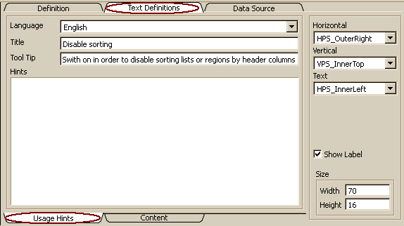
Usage hints
Usage hints include several text sections for helping the user to use GUI elements properly.
- Defining label or title for GUI elements (Title)
- Defining short help text (tool tip) for GUI elements (Tool Tip)
- Defining usage hints to be displayed when requesting more help by pressing F1 (Hints)
In order to edit usage hints, the Text tab on bottom of the Text Definitions form has to be activated, which is provided in all GUI resource forms that require or support text definitions. Some GUI resources, which do not support content or concept definitions, do show usage hints, only (and no bottom tabs for changing the description type).
In contrast to resource Description, which is content oriented, usage hints are user or application oriented, i.e. they are used for helping the user using an application.
Extended support is provided for the title (or label), which might be arranged at different positions inside or outside the GUI element. The Title or label will be initialized when creating new field definitions from the data source the field refers to. Size and position for control labels can be defined by means of the label position properties on the right side of the form. Details for label positions are described in data type documentation for ADK_LabelPosition (Label position).
The language for text definitions can be selected from the drop list. The default language is the language activated in the Designer's Options/Language menu. Changing the language allows entering the text in other languages.
The title or label text is the text to be displayed as control label, dialog or application title, menu item or button text.
A title or label text is a short text indicating what sort of data is going to be displayed in a control or window, or what type of action is going to be activated when clicking an action element (button, menu item). Labels are usually defined left or above a control, as column header, region label or as tab title. Hence, label texts are in general visible, when a field or action element is shown in a control.
Typically, labels should consist of one or two words. In general, label texts are limited to 80 characters. Titles displayed in window title bars might be a bit longer, but should also not exceed three or four words.
Control labels and window titles may be switched off by setting the Show Label option. Labels displayed for controls might be positions (left or right, above or below the control). Control label positions are usually defined in field resources (ADK_Field). Default settings are taken from label positions defined in the field control definition (ADK_FieldControl) linked to the field.
Tool tips are displayed automatically, when the mouse cursor stops moving over a control for a wile. Tool tips should contain a short description of the control content or type of the action to be performed. Thus, users may obtain additional information about many GUI elements. Tool tips are displayed as single line text and may not exceed 128 characters. When a status bar has been defined, tool tips are also displayed in the status bar.
The description field contains detailed usage hints explaining features of the windows and the ways to activate these features. Usually, it does not need to describe the control content, since this is subject of the data source definition in the data model. Since most data sources are linked with a description topic, content should always be described for the data source.
The description information is used together with data source and field/control documentation for providing exhaustive help information.
Control resources allow arranging label text outside or inside the control (left or right), as being requested by horizontal label position. The label position defines the position of the label area, but not the position of the label text within the area.
Control resources allow arranging label text outside or inside the control (top or bottom), as being requested by vertical label position. The label position defines the position of the label area, but not the position of the label text within the area.
For control resources, text alignment defines the alignment of the label within the label area. For buttons, it defines the label alignment on the button. Label text can be displayed left aligned in the label area (HPS_InnerLeft), right aligned (HPS_InnerRight) or centered (HPS_Center). Other values are considered as undefined.
In order to display the control label, window title or action name, this option has to be switched on in the field definition (ADK_Field)
The label size is used only for displaying control labels. For all other GUI resources it will be ignored. The label size defines the minimum size for the label. When the label does not fit into the defined area, the system tries to display it anyhow, when the control has been defined within a grid with flexible (growing) cells.