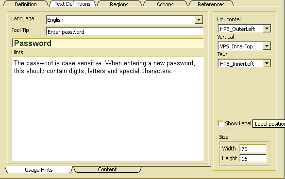
Text definitions
Several kinds of text might be defined for controls and action elements. Texts are multilingual and might be translated into any number of languages:

All text can be provided as default text when defining a control (ADK_FieldControl) in a design class. When referring to a field control via a field (ADK_Field) within a complex control, text definitions might be replaced by corresponding text definitions for the field. When a text has been defined for the field in the currently selected language, the text definition for the control will be completely replaced.
There are two types of text information, that may be entered. Usage hints describe how to use the field. Content describes the content to be displayed in the field. Both, content and usage hints are combined to an online help text, which may be activated by the default Help action of pressing Shift+F1.
More (conceptual) documentation may be provided via the documentation topic associated with the GUI resource. Details about editing documentation is described in Edit documentation.
The option indicates, that a label is to be displayed. Usually, the option will be overwritten in the field definition.
The label size defines the minimum size for the label text. When the label text dos not fit into this area, it may be extended when displaying the control.
The horizontal label position defines the label position relative to the control (outside or inside and left or right). HPS_Center centers the label area inside left and right control border.
The vertical label position defines the label position relative to the control (outside or inside and top or bottom). VPS_Center centers the label area inside upper and lower control border.
The text alignment defines the horizontal alignment of text within the label area. Inner or outer will be ignores, i.e. important is left, right or center.

